
English Education Ireland is the national representative body for accredited English language education institutions in Ireland.
Switch out the term "marketing" from the brand to better reflect the comprehensive role in: lobbying, professional development, and public representation;
Establish Authority: Reinforce the position as a trusted, key operator in Ireland, recognised by senior government officials;
Modernise Identity: Transition to a fresh, fun, and modern brand image that still conveys authority and professionalism;
Outdated Brand: The current brand, designed in 2008, features Celtic curves and traditional elements that feel outdated.

To strengthen the brand's connection to its country of origin and culture, thereby enhancing acceptance and familiarity, green is the primary colour used.
Reflecting these elements of familiarity and national and cultural significance, the colour palette incorporates shades found in Irish landscapes.
The logo's colours have also been updated to more contemporary versions.Beyond familiarity, the colours were analysed through the lens of colour psychology.
This approach ensures that the new colour palette conveys balance, optimism, energy, youth, knowledge, security, and wisdom.
Black Forest
HEX #263A0A RGB 38 . 58 . 10 CMYK 78 . 52 . 94 . 62
Lemon Lime
HEX #CBDC24 RGB 203 . 220 . 36 CMYK 29 . 0 . 90 . 0
Golden Sand
HEX #CFD178 RGB 207 . 209 . 120 CMYK 25 . 8 . 64 . 0
Amber Flame
HEX #F9B516 RGB 249 . 181 . 22 CMYK 0 . 33 . 91 . 0
Olive Leaf
HEX #35641B RGB 53 . 100 . 27 CMYK 80 . 36 . 100 . 30
Regal Navy
HEX #043664 RGB 4 . 54 . 100 CMYK 100 . 81 . 35 . 23
Celadon
HEX #AEE2BC RGB 174 . 226 . 188 CMYK 36 . 0 . 35 . 0
Cornsilk
HEX #FCF6D6 RGB 252 . 246 . 214 CMYK 2 . 2 . 22 . 0


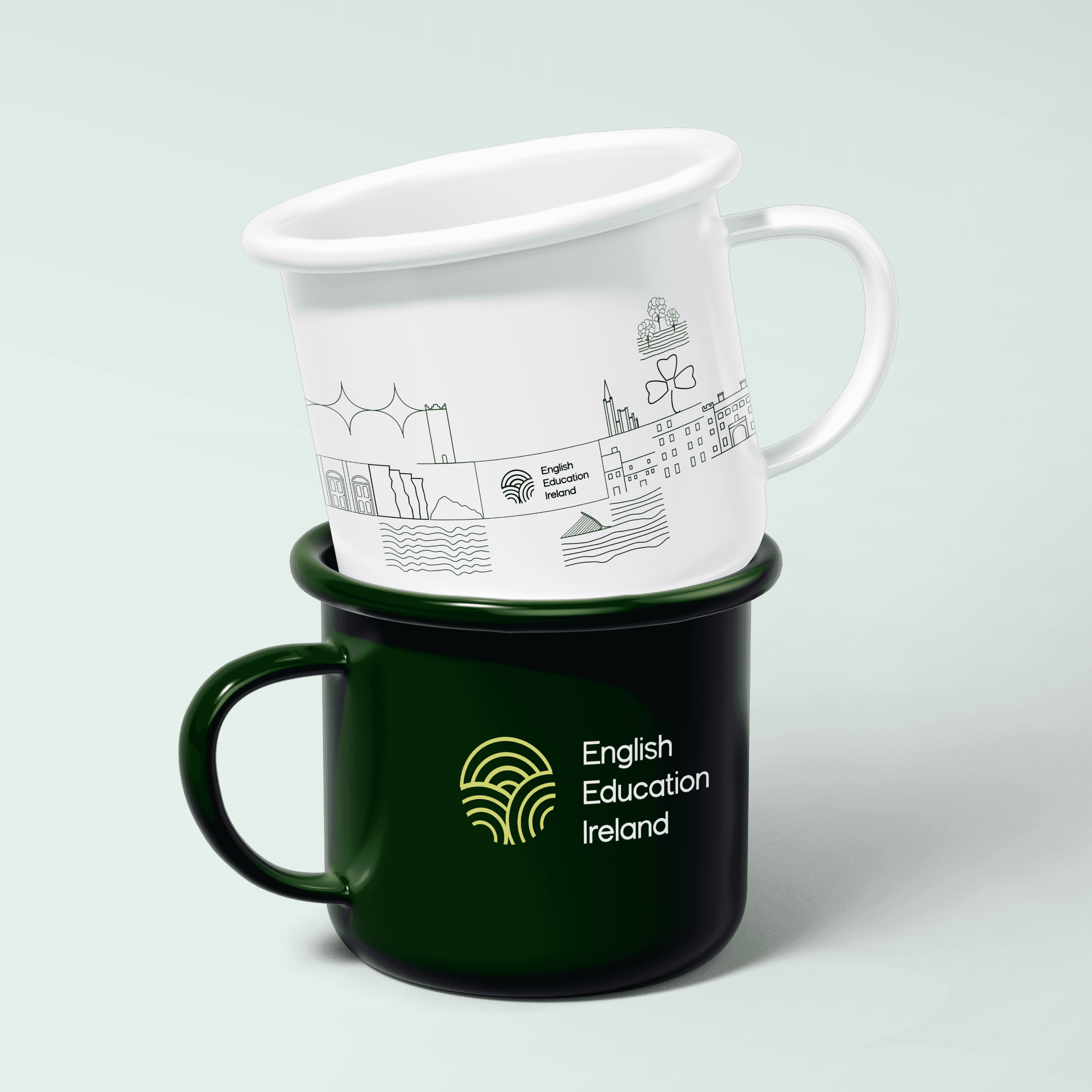
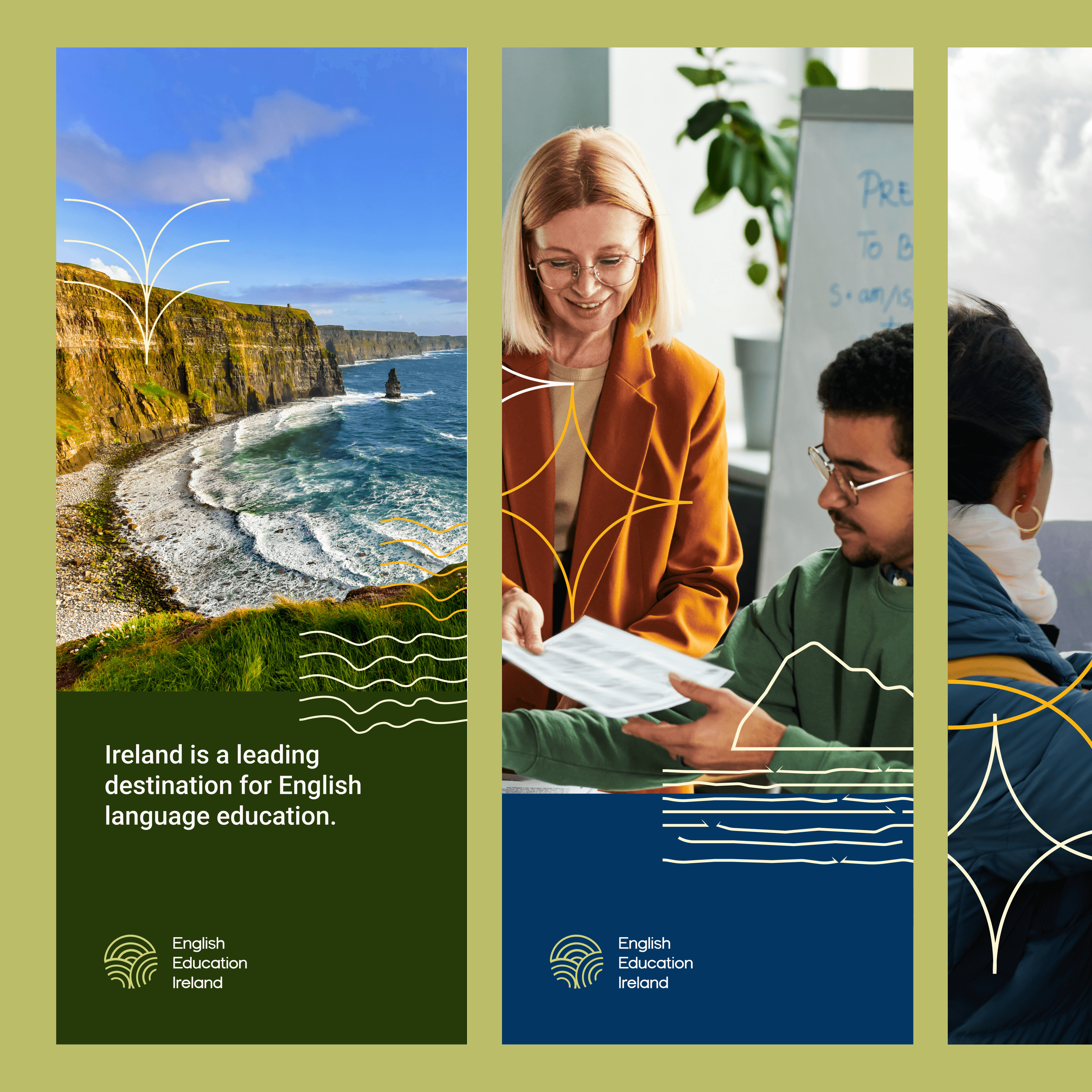
The icons were created through the analysis of landscapes, buildings, and elements of Irish culture.
They were designed for versatile use, whether individually in small applications or collectively in larger compositions.



The current brand does not have an easy-to-apply design, but it has a strong connection with Irish culture.
As the brand is already consolidated and known, we used this connection to start the rebrand.
The symbol used in the current brand, the Triskelion, has a great meaning, which is why we believe it would be very interesting to keep it in the rebranding. However, its format and colours do not represent the brand’s new moment. So we started testing the new logo using this symbol.
Through testing and experimentation, we realised that we could transform the current Triskelion into a more modern and applicable version.





Discover more case studies and see how we transform ideas into memorable digital experiences.

